
- ArticlesDesign
Designing right from wrong: Our principles for ethical products
Every design decision should be made on behalf of its end-users.
We want to ensure that our customers have a positive experience with all of our digital experiences and we believe that our design practices should be human-first. So we’ve put together all our best practices and guidelines into our design system, Yolk.
Here’s a few reasons why we’ve done this:
It takes two (and many more) to tango. A design system needs many participants. Fortunately at Cuckoo we have a wonderful blend of talent and specialism. I’ve taken control of much of the admin and UI (User Interface) of the system, but then we have Leanne with strong skills in UX and Ed with strong skills in visual design. Rose and Milly, two of our developers has been building our Design System from the ground up and all the other developers have their own specific strengths with which they’ve had input.
We’ve found that the more people involved in the creation of the design system, the better the outcome will be.

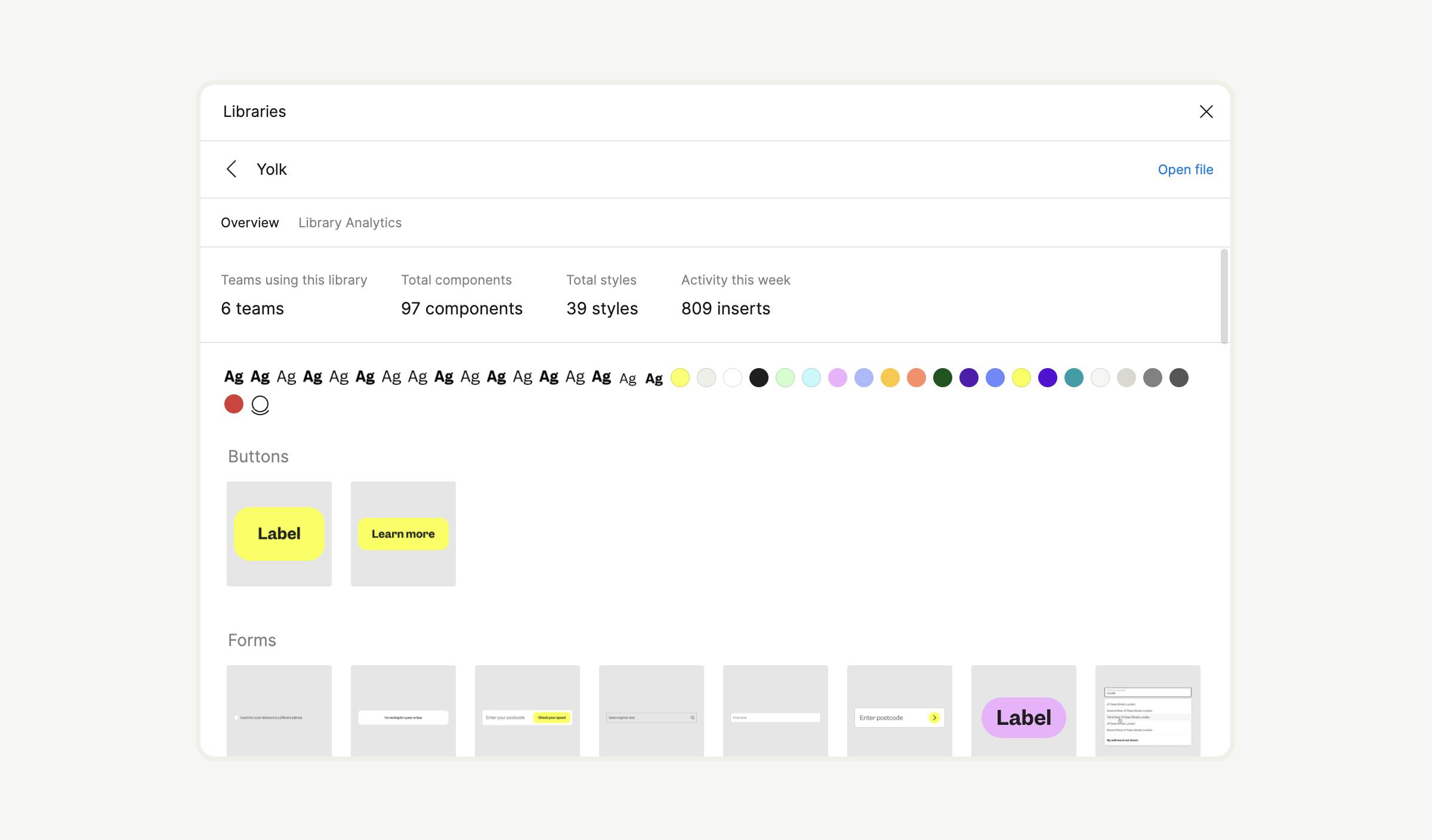
Organising Figma to work in the form of a universal design system is 50% of it all. Cuckoo is still relatively small (at the time of writing we have around 55 employees, with 3 designers working across all product lines). As we expect the team to grow, setting up a design system in Figma to work across all design files, for all designers, is really important.
To do this we created a ‘Design System’ team with private access (granted only to those who can edit the design system). We then created a file in this team called ‘Yolk’ (the name of our design system) and used this file to create a design system library. On the overall Cuckoo Figma admin, we added this library to be universal across ALL our Figma and Figjam files.
As a small detail, we found it to be really useful to have each aspect of the design system made as separate pages on the single file. For example, colours is one page, typography another, pictograms another. This was particularly helpful with creating components so that each component wasn’t layered with it’s file name - but all on one level (e.g. “Typography/Pigeon” or “Forms/Postcode checker”)
If you have any questions about this setup, please feel free to email me!
The starting point for Yolk was to define the basic starting elements from which to build out our digital experiences.
The elements we’ve used to build out Yoke:
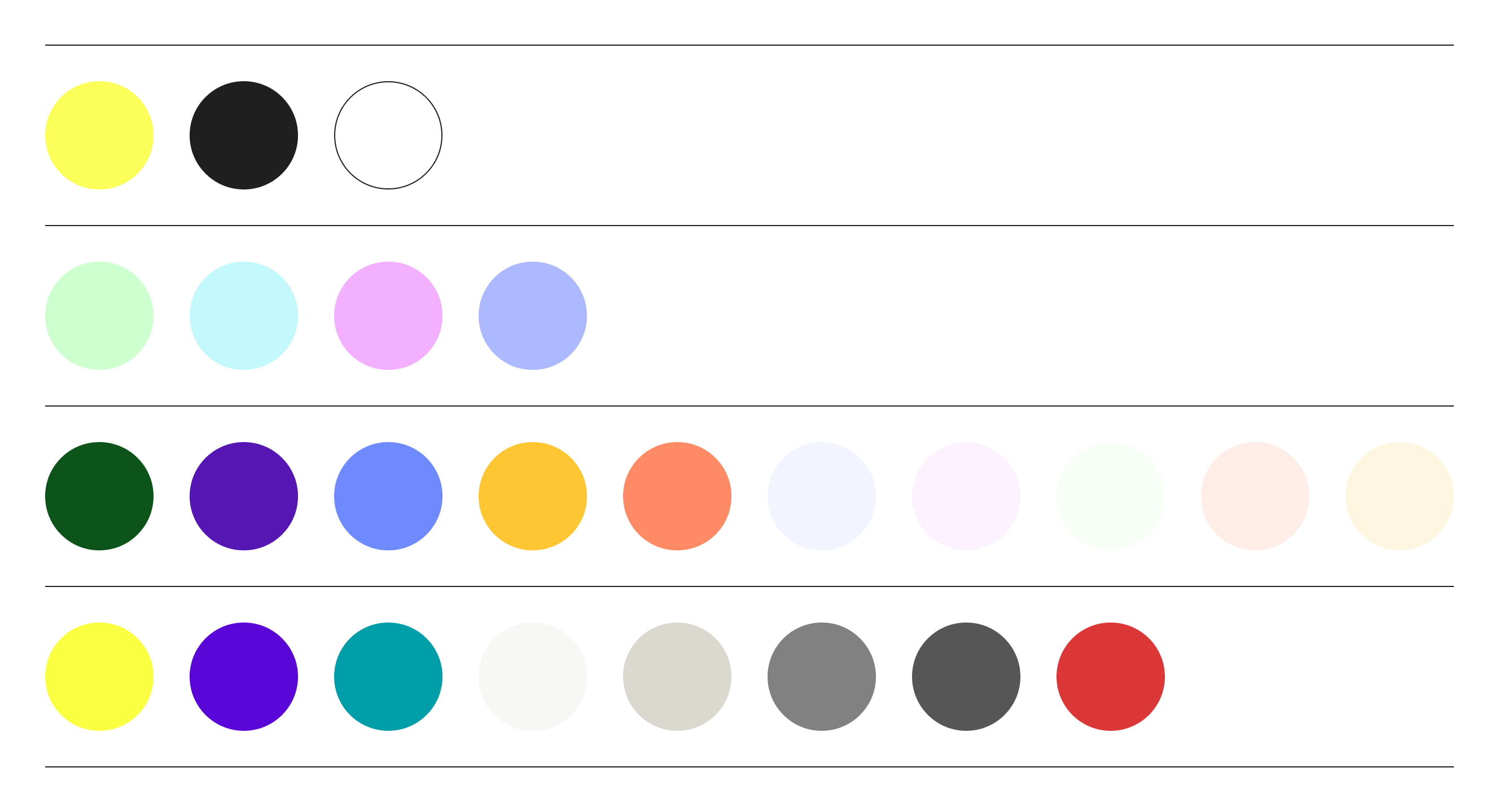
Below is our exhaustive list of colours. We’ve separated these out into primary, secondary, tierchary and UI specific colours.
Primary colours - these are the colours that need to define Cuckoo. We are a yellow brand and so the yellow alongside black (mainly for text) and white (predominantly for backgrounds) make up the core colours.
Secondary colours - you’ll see these secondarly colours making up many of the 3D graphics, animated text and other contextual parts of the brand.
Tierchary colours - these colours are more rare and are reserved for the odd online treatment and states. You’ll see them peppered more throughout our social channels.
UX specific - this set of colours is to be used specifically for the forms, fields and links on the site. The yellow is a more vivid equivalent of the core yellow - used for primary buttons. The purples and greens are reserved for links.
With our type system, we’ve intentionally gone with as few type styles as we can (we've landed on a total of 8). We’ve done this so that the design system and website are less cluttered and it’s much more easy to scale upwards. Instead of naming the styles after t-shirt sizes (small, medium large, etc) we’ve opted to use bird names - allowing us to create in-between styles in the future.
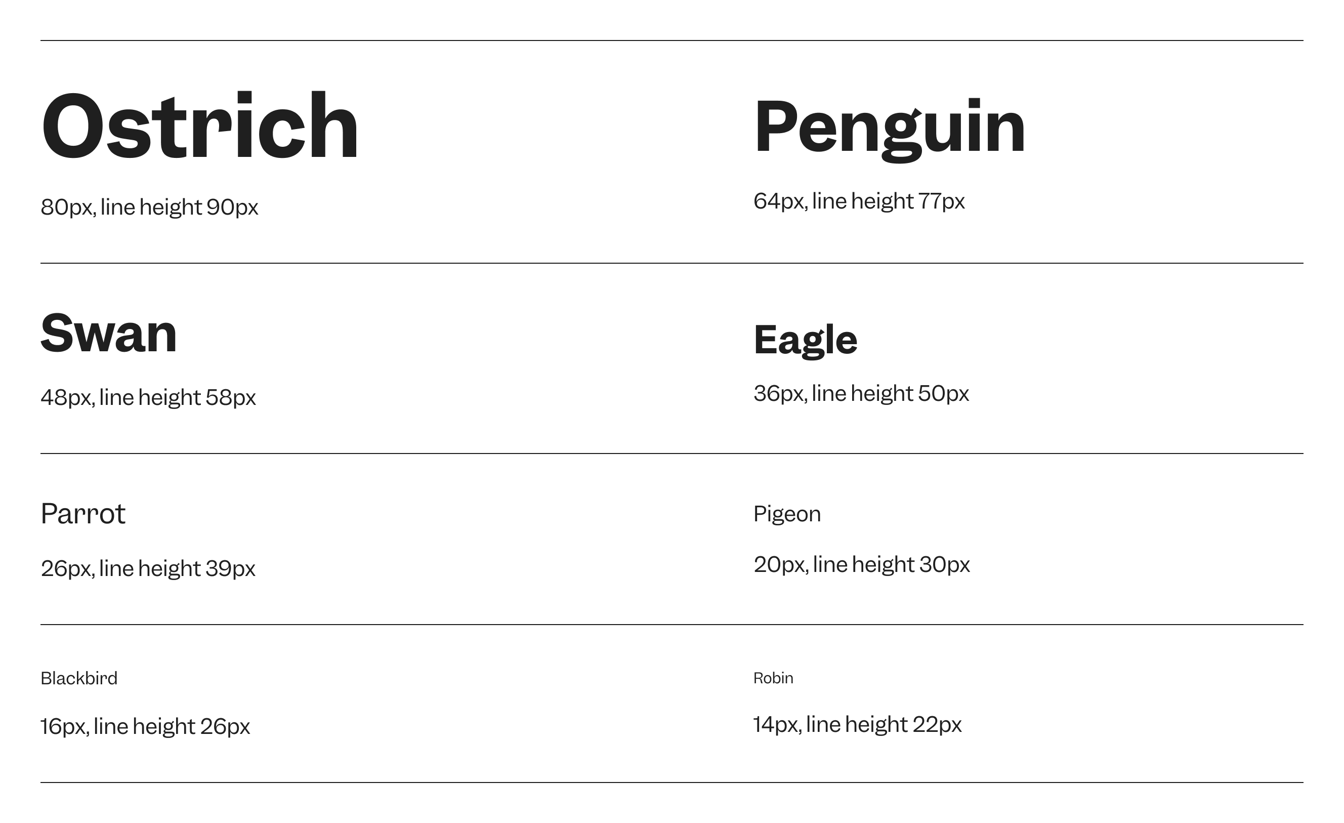
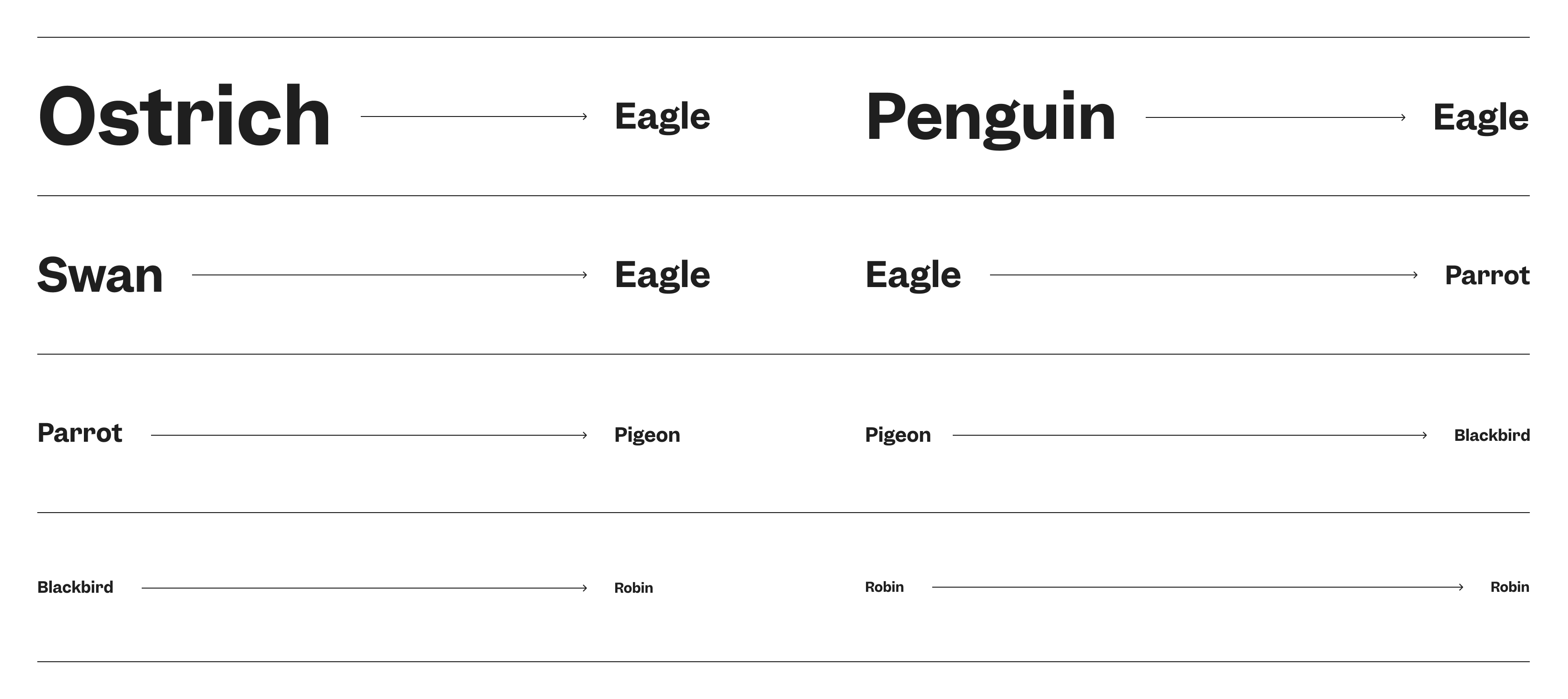
We’ve also defined rules for the type styles to respond at the 960px break-point. This has been done to ensure a solid level of consistency across all our digital products. The image shows how this rule functions, with the type style taking a step (or two) down.
Spacing is the negative area between elements and components. It is commonly controlled in code with and padding. We’ve designed Cuckoo’s digital products using a spacing scale - this scale can be applied to both the construction of individual components and the combination of components. We’re using 8px as the basis of our measurements, and using multiplications of this up to 10Rem (160px).
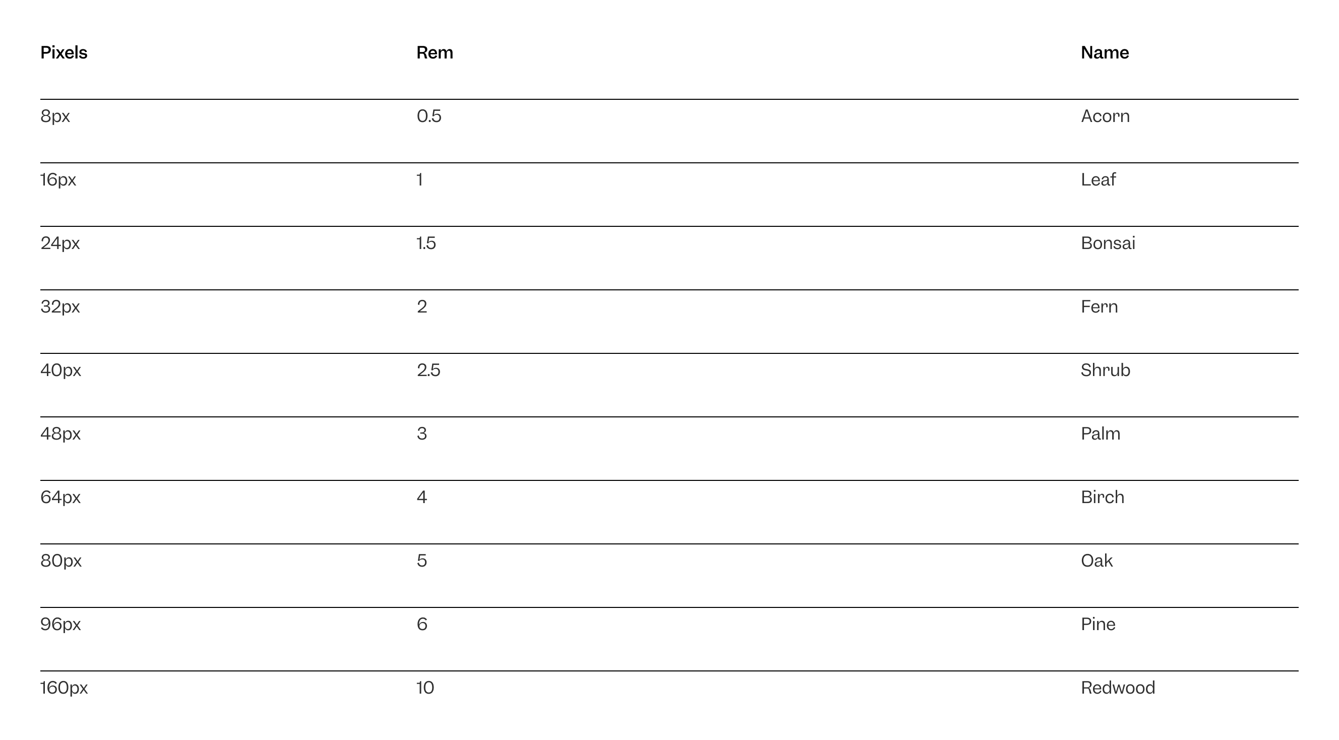
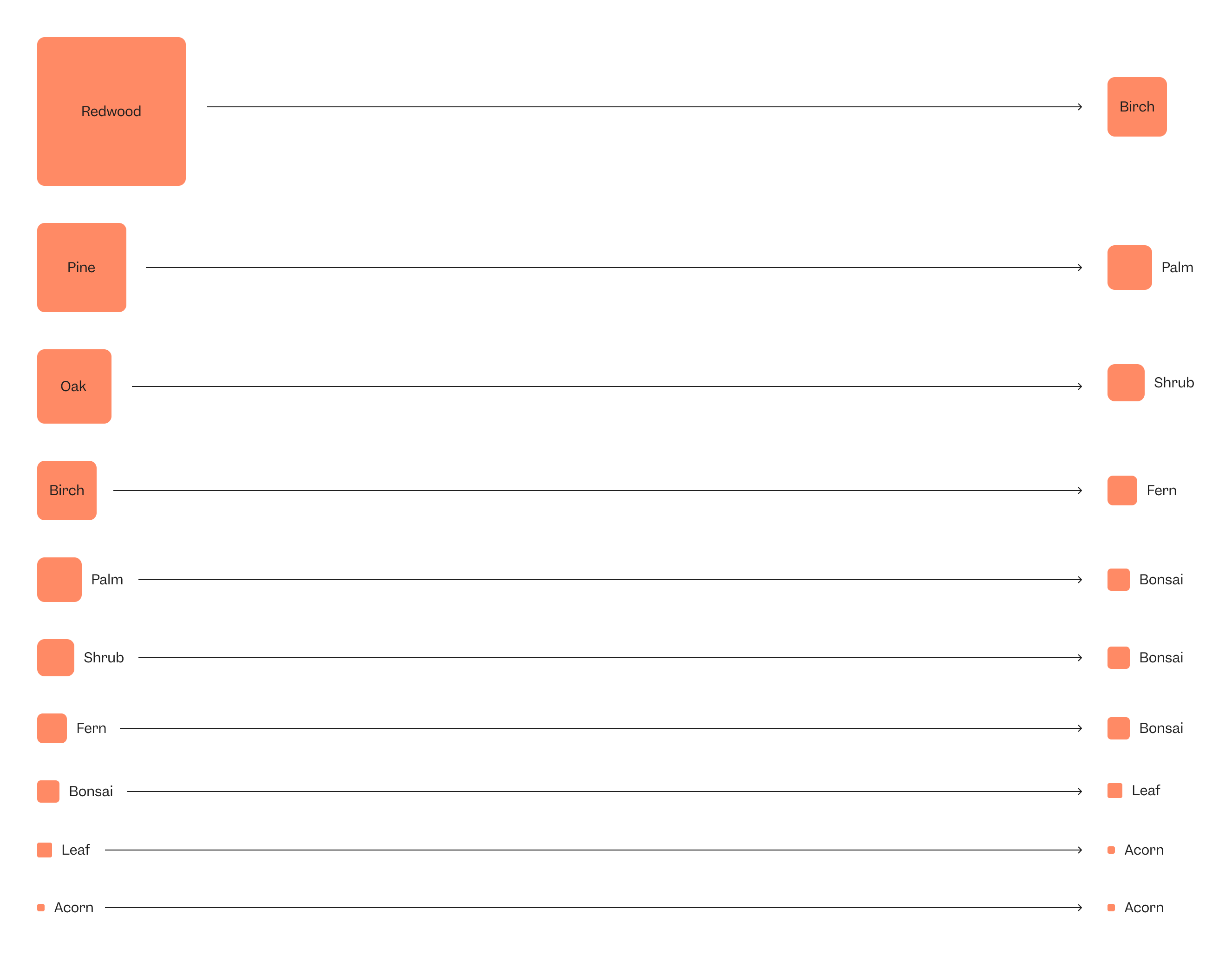
In a similar way to the type scale, we’ve attributed a name to each pixel size - this time using tree species. And, as with the type style responsive pattern, the same applies to the spacing for the 960px break-point.
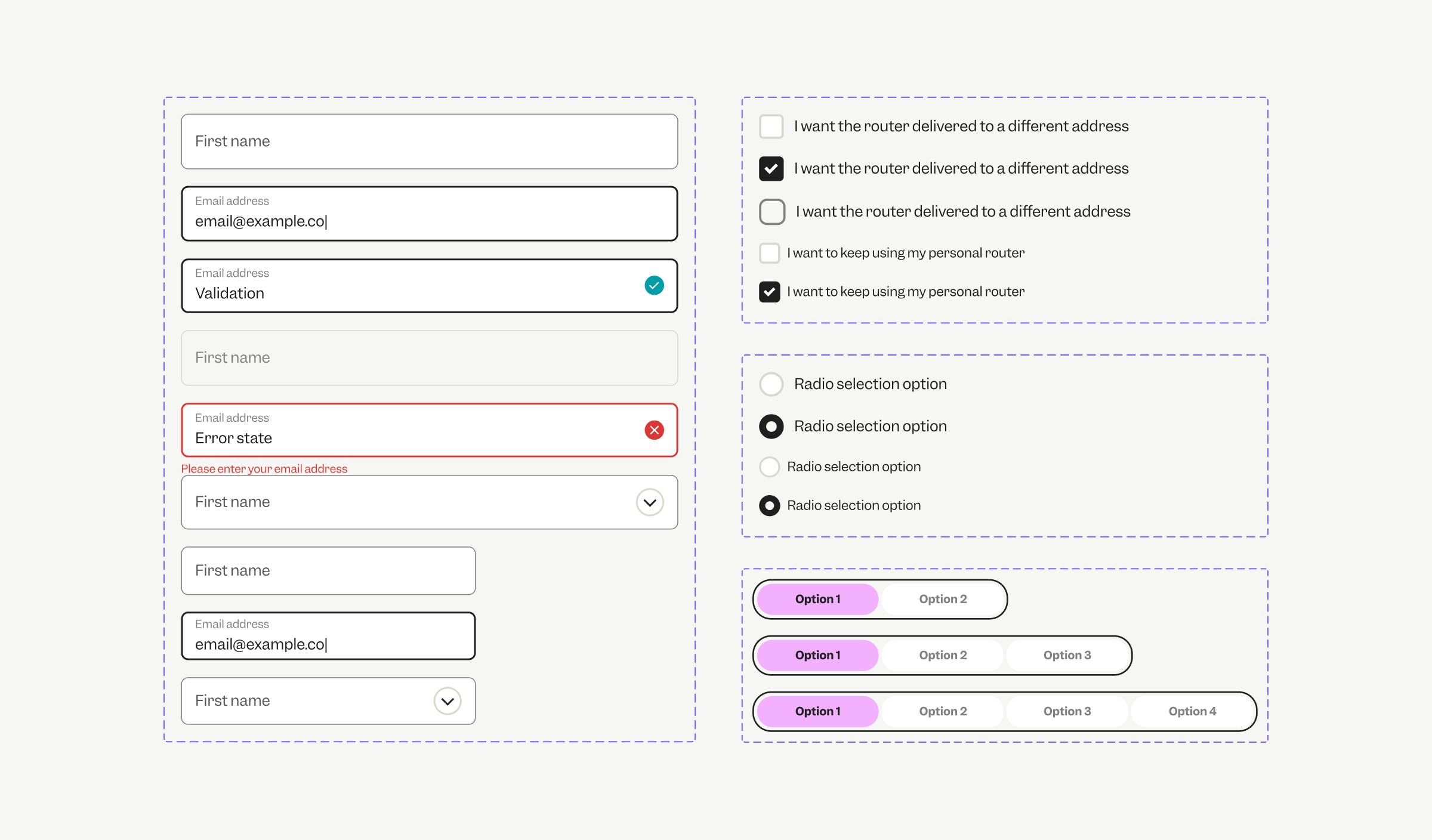
Once the basics have been determined, we can start to build out the core components that will make up the UI blocks of the design system. Here’s the components we’ve built out and that we feel are neccesary for a starting point:
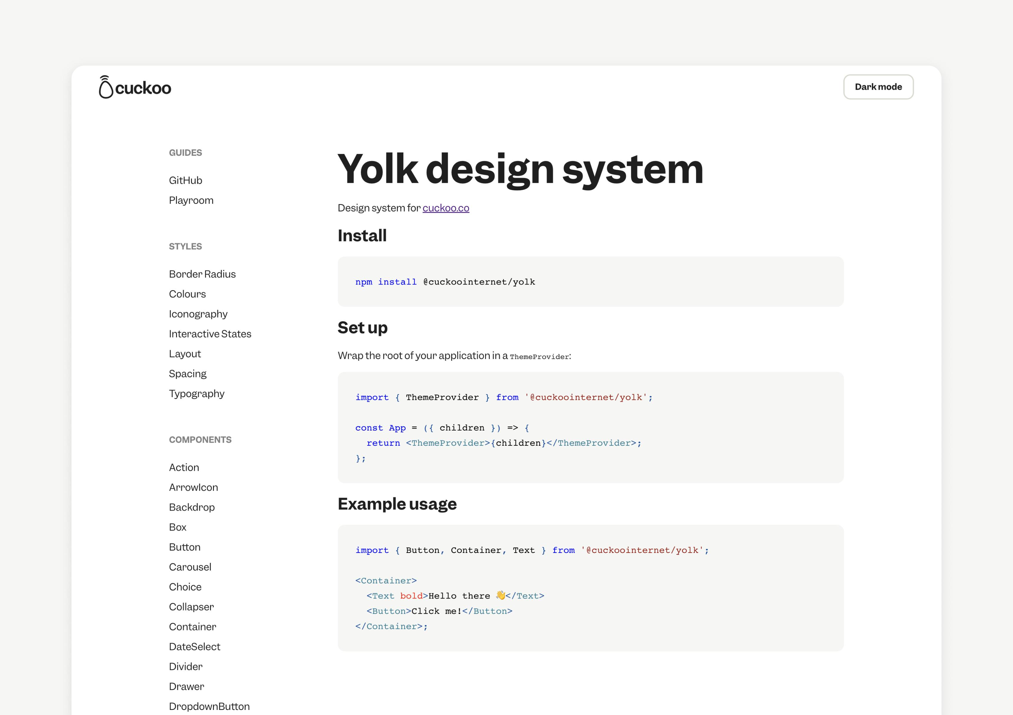
To document Yolk publicly we designed the documentation site which can be found at design.cuckoo.co. For more about why and how we did this, head over to my colleague Rose’s post all about it.
I hope this article was helpful or interesting and will help you understand more about the way Cuckoo does things. This has been a learning curve for all involved and it will continue to evolve, so please feel free to reach out with any feedback, comments or otherwise - we’d love to hear from you!
Every design decision should be made on behalf of its end-users.

Imagine bringing together over 300 people from different companies, cultures, backgrounds and experiences into one new company. How do you get those people to feel like one? Well, you ask them one simple question: What values do you want to have to make you feel like you belong at Cuckoo? .